tips4designer

Sharing tips, note, tutorial for designer

Typography: Common Myths and Mistakes

Since the first GUIs introduced word processors with a selection of fonts virtually anyone with a computer has been able to set their own type (before that we even had typewriters – remember those?) and, for the most part, that’s a good thing. The world as we know it would be very inefficient indeed if every school report, office party invitation or missing cat poster had to be manually set by trained professionals. However, Microsoft Word doesn’t ship with The Complete Manual for Aspiring Typographers – in fact it doesn’t ship with any design sense at all – and so the masses uncritically embrace the MS conventions, blissfully unaware of the centuries (some say millenia) of principles from which professional typography draws from today.

Now, if you’re a designer and you know your typography you probably won’t learn anything new from this little post, though it might help educate your clients about some common myths and mistakes in layman’s typography. At the very least I hope you’ll grimace in agreement as I run through a few gripes of mine with typographical practices perpetuated by non-designers.

Here goes.

Double Space After Full Stop (.)

Let’s be clear about it: there is no need for double spaces after full stops. You may never have encountered, or noticed, this phenomena, but if you have you’ll know how annoying it is to have to go through the lot and correct it (granted, search and replace makes this easier than it used to be, but auto-correcting a 100 page document without manually controlling the result is never a good idea). When I used to work in print, removing double spaces was a routine and part of our artwork preparation cheat-sheet. But where did all those extra spaces come from?

Is the double space (top) necessary to divide the sentences or is a single space (bottom) enough?

Double spacing, i.e. the insertion of two spaces after full stops, became popular with the introduction of the typewriter in the late 1800s. As typewriters were using monospaced fonts it was felt that a single word space wasn’t wide enough to sufficiently separate sentences. Hence, an extra space was inserted to help mark the end of a sentence.

That may well have been a reasonable concern a few decades ago, as noticing the start of a new sentence definitely helps readability (though if personally I think a single space is sufficient even for typewriters). Nowadays, however, type designers assign appropriate horizontal space to each character – including the humble full stop – making double spacing obsolete. A single space combined with a capitalized first word marks the next sentence clear as day. So please, let’s just stop it. (I seriously considered including the word “full” in that last sentence, but figured such a pun would conjure involuntary facepalms and stop you from reading the rest of the article.)

Title case headers

Speaking of capitalising first words, how about capitalising all of them (in headers, that is)? Up next, the incredibly annoying and, unfortunately, equally wide-spread: Title Case Headers.

Sentence case (bottom) makes sense for readability – why do we cling to disturbing capitalisation (top)?

Some people mistakenly refer to title case as camel case, though the comparison is fitting: using title case makes your headline about as calming and legible as a line of camels stampeding across the page. Why on earth would people insist on a practice that deters readability?

Capitalising headers goes back a long time and probably stems from the Germanic urge to capitalize “important” words. Historically we’ve capitalized a lot – including nouns, pronouns, places, honorifics, even adjectives – and we still do (the specifics depending on where you’re from.

As a result the rules of titling are a tad confusing: Capitalize all words, except for for closed-class words such as articles, conjunctions and prepositions. Unless the preposition is a long word like “Between”, that is. Oh, and capitalize pronouns, even though they’re closed-class. And just make your own mind up when it comes to hyphenated words. What gives?

Whether it’s all words or just nouns, ultimately it seems to be about adding emphasis or importance to words. Surely, though, the whole headline is emphasised by definition so unless you want to go full uppercase, why not just leave it as it is? Fortunately that’s exactly what many British publishers (including The Economist, The Guardian, The Times) decided to do, and we’re better for it. Sentence case is much easier to read, and no-one (well, apart from the Germans) capitalizes nouns anymore anyway.

Justified Text

If there’s any client request that invites my confused face more than “can you make my logo bigger?” it’s got to be “justify everything”. It’s easy to reason against it, of course, but just what is it about justified text that makes it so appealing? It seems every Tom, Dick and Harry wants – no, craves – it, no matter how illegible it makes their copy.

Notice the islands and rivers of white space in the justified paragraph (left) contra the even spacing of the left aligned )(right). Which is easier to read?

Historically it was thought that left aligned text was “disorderly” due to the irregular lines on the right side, and so justified compositions became part of a tradition of symmetrical construction around the central folds of pages. That’s history, however, and I fail to see the reason why this idea is so prevalent still. Granted, when it’s done right justified text may to some look a tad “prettier” than left-aligned, but if the modernist typographers taught us anything it’s that the purpose of typography is not to be pretty, but to be readable.

And that brings into question another argument for justified text: that it utilises the space better. This is partly a fallacy as justified text doesn’t actually fit much more on a line, it mainly moves the irregular spaces from the right hand side into your content. This creates disturbing rivers of white space that actually prohibits good readability (you can help this by carefully adjusting your H&Js in inDesign, though it’s not possible with CSS).

In short, don’t go for justified text unless you really have a good reason to – if you want to save space or can’t live with irregular lines, hyphenate and manually add soft breaks to even it out. If you can’t do that (web has it’s limitations), just suck it up. The readability of your content is, after all, more important than forced symmetry.

“In a perfect world, all text should be unjustified and range left.” – Enric Jardi

Double or Single Line Space?

Back in school, I was always told to set our my essays in a certain font at a certain size (usually 12pt) at a certain line space – either 1.5 or double. Umm, double what, exactly? For reasons unknown Microsoft Word decided to dumb down their software and not only change the term leading to line space but also change our concept of it from points (“please set the text at 12pt using a leading of 15pt”) to vague units (“you’re probably too stupid to understand the basic concept of leading, so just hit the button that says “double line space”).

Granted, a limited set of line space variables may be easier to comprehend for the end users – if we underestimate and patronise them – and the consistency of school reports may be impeccable, but at what cost? Imagine if plumbers and electricians all used the metric system, whilst consumers were only taught imperial in school – it simply wouldn’t be very efficient. Changing the global consumer’s understanding of the any typographical concept only extends the bridge between designers and our clients. I know explaining leading to people is pretty straightforward, but wouldn’t it be easier if we all spoke the same language and used the same units of measurement? Refering to leading as single or double line space is not just confusing, it’s also inaccurate.

Now, why CSS calls it line-height is a different story.

Bold and Italics as Styles

One of my biggest gripes with MS Word and any other simplistic “publishing” software and “WYSIWYG” editors is how they apply bold and italics (again, CSS is not without guilt). I’m not criticising the usability here – clicking a button or, better still, pressing CMD+B is quicker than selecting “Helvetica bold italic” from a dropdown – but I am questioning underlying concept. As with line spacing, the simplified alternatives to professional typography offered by mass-market software creates separate sets of terminology and understanding. Reducing bolds and italics to mere buttons infers that they are simply styles applied to whatever font you’re using. They’re not. They’re carefully crafted fonts emerged from months of hard work and incredible attention to detail. And I’m not even a type designer – imagine how they feel!

Bold: Akzidenz Grotesk (AG) regular with bold applied in MS Word (top) and AG bold as supplied by the foundry (bottom)

Italic: AG regular with italic applied in MS Word (top) and AG italic as supplied by the foundry (bottom).

Not that it’s about feelings. It’s about integrity and respect for the typographic profession. If you apply italic without having the italic font of a particular typeface installed, MS Word will create the italic font for you. That’s right. The computer – not a type designer – alters the font to what it determines the font should look like. Not only does this result in sub-par typography, it also makes it unnecessarily difficult to explain to a client why they need to fork out for the whole family of fonts in order to get the range of weights needed.

So make sure your client knows it: they’re not styles, they’re fonts.

Fantasy fonts

Ah, the fantasy fonts. Isn’t it just amazing that we can write the word “Cactus” with prickly letters and use a font made from vine leaves to spell out “Wine”? No. It’s not. There is no need to use Bleeding Cowboy to accompany your Western comic, nor is Double Feature the ideal typeface for a bloody horror flick.

The timeless elegance of the original Scream poster is easily ridiculed by using an over-the-top fantasy font.

Choosing the right typeface is a difficult process, but using the physical attributes of the thing you’re designing for as the criteria to make the choice is seldom a good idea. Instead, choosing a typeface that compliments the underlying emotions or mood of the text often leads to a more subtle, professional and timeless result. Better still, don’t worry too much about adding flair to the text you’re setting. Instead make sure you’re not communicating anything you – or the author – does not want to communicate. For example, setting a party invitation in Comic Sans (though not strictly a fantasy font) might communicate that the party is informal, but it also signals that it will be immature, childish and completely void of finesse.

All typography conveys a certain mood or atmosphere, and it does so best through subtle means. If the difference between serif, slab and sans isn’t quite enough variation, imagine the incredible diversity available when adding different weights, cases, tracking and contrast to the mix. Some would even argue we have too much variation and that a single font – Helvetica, for example – is all we need.

“You can say, ‘I love you’ in Helvetica. And you can say it with Helvetica Extra Light if you want to be really fancy. Or you can say it with the Extra Bold if it’s really intensive and passionate, you know, and it might work.”

– Massimo Vignelli, Helvetica

Join the Discussion

So there you have it – a short list of my personal gripes with layman’s typography. It’s by no means exhaustive, and I’m sure most of you can think of plenty to add to it. Do you have a client who insists on right-aligning quotees or refuses to accept bulletpoints that aren’t indented? Join in and share what typographic practices do you come across that you’d rather be without.

Source : http://designinstruct.com/web-design/typography-common-myths-and-mistakes/

Metal: Texture Pack

Preview

Free Metal Textures: Preview

Free Metal Texture 01

Free Metal Texture 01

Download

Free Metal Texture 02

Free Metal Texture 02

Download

Free Metal Texture 03

Free Metal Texture 03

Download

Free Metal Texture 04

Free Metal Texture 04

Download

Free Metal Texture 05

Free Metal Texture 05

Download

Free Metal Texture 06

Free Metal Texture 06

Download

Free Metal Texture 07

Free Metal Texture 07

Download

Free Metal Texture 08

Free Metal Texture 08

Download

Details

Download Source Files

Source : http://designinstruct.com/free-resources/textures/free_metal-textures/

Winners of $99 Worth of Stock Photos on TheAdStock

The Winners

Here are the two winners:

Congratulations to our two lucky Design Instruct readers! The winners should have already gotten an email from me with information regarding their prize.

SQL query result that selected the winners at random. Email addresses of the winners were removed in the above image.

About TheAdStock

TheAdStock is a stock photography site where you can buy images for your banner ads, websites, blogs, flyers, brochures and other advertising materials, digital or printed. Check out their growing collection of stock images (they add to the collection each week).

Follow TheAdStock on Twitter and Like them on Facebook.

Source : http://designinstruct.com/giveaways/winners-of-99-worth-of-stock-photos-on-theadstock/

Your Creative Workspace: A “Clean” Perspective

I’ve never been one for organizing and keeping things neat. I enjoy a little chaos and dynamism in the places I choose to work since it keeps me on my toes a little bit. However, as practicality demands, I do have to empty out drawers and folders and notebooks filled with accumulated junk every 3 or 4 months lest I be labeled a hoarder (which I don’t think I am).

History in the Making

What I realized I enjoyed about doing a purge of the junk I accumulated in last 3 or 4 months is that doing so has a time-capsule quality about it. Believe me, it’s definitely a pain to have to pore over what I know is junk. However, what I realized is that the movie stubs, receipts, invoices, lost business cards of people I’ve met, used up pens and broken pencils, and random pieces of paper with sketches and thoughts written on them, all combine to form a sort of archaeological record; a history; a narrative of the last few months of my work life. Our work spaces are a big part of who we are. They are bound to accumulate traces of your life since you spend quite a bit of time there.

As I pored over what I’ve collected over the last few months, sure enough,  I was reminded of the ideas that came and went. I was reminded of conversations I had with people; of days when I could not come up with anything; of moments when I thought I had a game-changing idea. I was able to piece together a story of the last few months. And while I still planned on throwing everything out, having that story (when I would otherwise have forgotten about it) is valuable for a couple of reasons: 1) so that I know where I can avoid making the same mistakes and 2) so that I know where I can succeed even more in the way I work.

Learning from the Past

Cleaning out your creative work spaces not only relieves you of the burden of holding onto what ultimately amounts to junk, it also allows you to revisit and reflect on the last 4 months with fresh eyes and a new perspective. An idea that might not have worked 3 months ago is suddenly something I might be able to do this time around. An old sketch that I intended to develop but forgot about is now something I can think about doing again.

The best part is that I am 4 months older with 4 more months of experience and 4 more months of mistakes and lessons learned. While that may not be a long time in the big scheme of things (for instance, some people don’t read their diaries until they’re old and gray), it’s still enough time that I can reflect on it meaningfully and revisit my old ideas in a fresh light and perhaps even use them. A lot can change in that span of time and if you look closely at your own life, you’ll realize that a lot often does.

Doing a purge of the junk in your work space is, effectively, also a purge of all the junk you have in your mind. All your bad ideas, your unfinished work, your meaningless musings all go in the trash and you’re left with a distillation of all the good parts of your work (the things you choose to keep).

Parting Words

While not all of us will have the  opportunity to do a purge like that one I do every 3 or 4 months (most of you, I’m sure, are more fastidious and organized when it comes to your work spaces), there are still certain corners of your creative lives in which you can undoubtedly create a record. It might be that “miscellaneous” folder in your computer, your filing cabinet, that tray in which you empty out your pockets after you come home from work, or just a simple diary in which you purposefully create a record. No matter how you create a record of your creative lives, there’s no doubt that there’s value in being able to revisit your old ideas and learn and perhaps even capitalize on them.

Therefore, if you’ve been putting off doing a spring cleaning or are averse to the prospect of having to do the work involved in purging all the unwanted/unneeded junk in your work spaces, know that there’s often a light at the end of that tunnel. At best, you’ll come out of the purge more enlightened and enthusiastic about your work. At worst, you’ll have a clean work space.

Tell us what you think in the comments section or on the Design Instruct Twitter feed @Design Instruct.

Source : http://designinstruct.com/articles/inspiration/your-creative-workspace-a-clean-perspective/

30 Excellent Textured Website Designs for Inspiration

Textured website design example: Leaders - The ConferenceLeaders – The Conference

Textured website design example: Maryland Craft Beer FestivalMaryland Craft Beer Festival

Textured website design example: Kinetic V5Kinetic V5

Textured website design example: Empire VintageEmpire Vintage

Textured website design example: LefftLefft

Textured website design example: tabspressotabspresso

Textured website design example: FormfettFormfett

Textured website design example: The Archer GroupThe Archer Group

Textured website design example: JoppJopp

Textured website design example: Gold Top CiderGold Top Cider

Textured website design example: WunderkitWunderkit

Textured website design example: Francesco MugnaiFrancesco Mugnai

Textured website design example: Mathieu StrabachMathieu Strabach

Textured website design example: 365 awesome designers365 awesome designers

Textured website design example: Nike VisionNike Vision

Textured website design example: The Peach DesignThe Peach Design

Textured website design example: MobyMoby

Textured website design example: Adrian BaxterAdrian Baxter

Textured website design example: DecodeDecode

Textured website design example: Woodlands of Baton RougeWoodlands of Baton Rouge

Textured website design example: 1LOVE1LOVE

Textured website design example: 1MD1MD

Textured website design example: Luhse TeaLuhse Tea

Textured website design example: BelongBelong

Textured website design example: Gerren LamsonGerren Lamson

Textured website design example: NOMOONNOMOON

Textured website design example: Code SchoolCode School

Textured website design example: Kansas City CreepFestKansas City CreepFest

Textured website design example: Launch FactoryLaunch Factory

Textured website design example: Buffalo LoungeBuffalo Lounge

More Textured Web Designs for Inspiration

Here are our other previously published showcases that feature textured web designs:

Textured Web Design Tutorials

Check out these website layout design tutorials from our Web Design tutorial category.

Source : http://designinstruct.com/visual-inspiration/web-design-inspiration/textured-website-designs

Create a Powerful Mixed-Media Composition in Photoshop

I will be using a graphics tablet for the painted part of this tutorial but you can also achieve the effect using the Pen Tool. Let’s get started!

Tutorial Resources

Preview

Step 1: Document Setup

First open a new document in Photoshop, this should be 3300×5100 pixels with a resolution of 300dpi. Using a size like this will enable us to print on relatively large formats while also maintaining the best quality possible.

Step 2: Background Setup

We are going to put some textures on our canvas so that we have a nice background to work with that will bring out the best of the main components of the illustration. Take the texture stock image and drag it into your canvas and then stretch it to fit the workplace.

Desaturate it (CTRL+SHIFT+I), change the layer blending mode to “Multiply” and lower the layer opacity to 15%. We need to bring a little bit more of the whites on the image, and to do so we are going to bring up the Levels Menu (CTRL+L) and apply the next settings:

Now Download the Paper texture image and repeat the last step.

Desaturate it and change the layer blending mode to “Multiply” then go again to the Levels Menu:

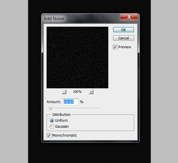
We are going to add further texture to the background. Create a new layer and fill it with color black using the Bucket Tool (G)  and we are going to add some noise to it. Go to menu Filter>Noise>Add noise and use the next settings:

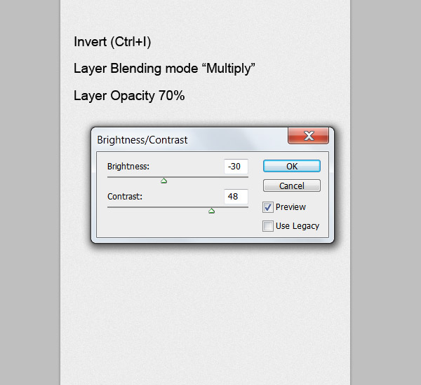
Invert it (CTRL+I), change the layer blending mode to “Multiply” and lower the layer opacity to 70%. We need to have a little more darker image to get the best results with this texture, so go to menu Image>Adjustments>Brightness and Contrast and change the Brightness to about -30 and the contrast to 48.

The background still needs some color to match the overall composition. For this, we need to create a new layer and fill it with a light blue color: #96adc8. Change this layer blending mode to “Color” and lower the layer opacity to 20%.

Step 3: Animal Integration

Take the snow leopard stock image and drag it into your document. Select the Pen Tool (P) and slowly trace a path along the silhouette. Don’t be too picky with all the hairs, we are going to fill that out later.

Once you have the path,right-click and select the option “Make selection” and under the feather radius settings use 3 pixels as feather.

Now invert the selection (CTRL+SHIFT+I) and press delete to erase everything around it. Place the lion on the top right part of your canvas. We are aiming for a fresh composition with this illustration.

Now, we are going to start doing all the “over painting” on the image to get that painted finish. Select the Brush Tool (B) and chose a normal small round brush about 12 pixels wide with 100% opacity and 0% hardness.

Now go to the Brush presets menu and under the Brush Dynamics under the size jitter option, make sure you have selected the “Pen Pressure” on the Control.

As said before, I’m using a graphics tablet to do this part of the tutorial because of the pen pressure settings, but if you don’t have one, you can do this by using the Pen Tool with the same settings and stroking different paths; creating clusters of hair and just cloning them and placing them around the image. I will explain this as we go on.

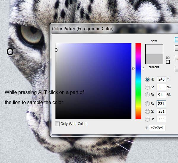
We will be using the main shape of the leopard as a reference for the direction of the strokes and the colors we will be using. By pressing and holding ALT and then clicking over any part of the animal, you can sample a color. We will be filling out the edges of the leopard first and then we’ll make our way through the middle starting with the darker tones.

Create a new layer on top of the leopard and now with the Brush Tool, stroke in the same direction as the fur goes. If you are using the Pen Tool, draw a path in the same direction of the fur and then right-click and select “Stroke”.

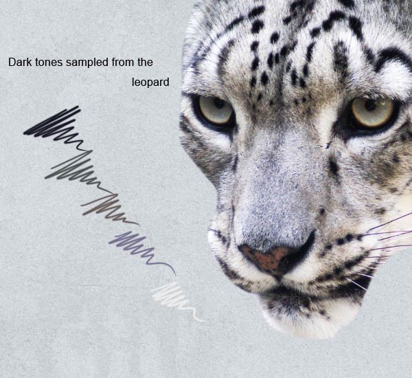
Start off by sampling first the darker tones of the hair to make a nice base, and as you progress, sample the lighter colors that will give this effect a lot of depth and realism.

Try to variate as much as possible between the colors you use trying to match the ones on the fur. This process might be a little slow at first but it will look better and better the more layers of fur you add.

If you are using a graphics tablet, just keep stroking until you fill most part of the image. If you are using the Pen Tool, the best thing you can do to save time is to stroke some areas several times and then duplicating the layer and using the Move Tool (V) rotate it and position it on another spot.

Make your way from filling the edges first and then work your way to the middle.

Keep adding more layers as you go. Don’t overdo it though. Try to keep it as organic as you can.

After a few layers of painted fur, try to edit down any clusters that might take away too much attention. You should now have something like this:

As you can see from the original leopard image, the top is a bit cut so we need to fill that. Use the same procedure as before but now the all the strokes should be longer and in one direction to keep a nice flow on the animal.

Do not forget to add the whiskers. Do them by sampling the color of the other ones on it’s face and paint them with long strokes.

This part of the animal is almost done but it needs a little more detail to make it pop. We are going to do this by stroking some more pure white lines along the leopard. Change the width of the brush to a lower size and select white as your foreground color.

Now do several strokes along the whole body of the lion to give it more impact. Something like this:

Putting these extra details will make it look more polished and finished.

For the eyes, just sample some colors from the original image and paint over to bring out all the details it already has. It doesn’t have to be completely exact but with a couple of white details around the edges, they will look much better.

This is the result,after all the over painting is done. You should have now something looking similar to this:

Step 4: Branches

In this step, we are going to start working on the positioning and manipulation of the branches. This element on the illustration will be what sets the flow and main composition of the image.

Take the Branches stock image and open it on Photoshop. Using the Pen Tool draw a path around the tree branches to extract it. Try to be especially careful to get as much detail as possible while extracting it because the more detail you preserve, the better it will look.

After extracting the image, select the branches again (ALT+CLICK the layer thumb) and go to menu Select>Modify>Contract, then invert the selection and press delete. This will erase any edges we might have left from the background on the image. If your extraction didn’t have any remains of the background on the edges, you can skip this step.

Go to the  Hue and Saturation menu (CTRL+U) and apply the next setting to desaturate a bit the color of the branches.

We also need to make the blacks on them a bit darker to give it more contrast against the background. For that, open the Levels Menu (CTRL+L) and apply the values shown below.

Take the other Branches stock image and extract it from the background the same way we did with the first one.

Now that we’ve got our branches extracted we are going to start placing them around to build up our composition. All the branches layers we are going to place right now will be going behind all the lion layers.

Use the Move Tool (V) to rotate and resize this layers. Use layer Masks to clean up and hide parts of the branches that break the composition.

Play around with the position of the branches, I chose to place them diagonally to get an interesting flow in the image.

Step 5: Roses

Drag the Rose stock image to your canvas and extract it the same way we did with the branches. Use the Move Tool (V) to change it’s size and rotate it slightly. Place it above the leopard’s eye.

We need to change the hue of the image to match the color palette we are using on our composition. Bring the Hue and Saturation menu (CTRL+U) and change the color of the rose to a light blue hue.

Now we need to paint a shadow under the rose to blend it to the composition. Create a new layer and place it under the rose. Go to your Brush Tool (B) and select a small, soft round brush about 100 pixels wide and lower its opacity to about 20%. Select black as your foreground color.

Now brush softly under the rose to create the effect of a shadow. Stroke as many times as you need where the shadow should be stronger. Use the light source on the rose as a reference on where the shadow should fall. In this case, the shadow falls to the lower right side.

Drag the second Rose stock image and extract it from its background. We are going to finish the details of the composition using only this two roses images duplicated several times and resized and even tho will be using them several times, the cluster of roses around the leopard and the branches will look different.

Like the rose before, we need to change the color on this one:

Now, using the Move Tool and duplicating the rose layers, start forming clusters of roses around the leopard. Play with the position of the layers. Put some of the roses on top of the branches and some others below them.

Try to keep the roses together for better results but be careful not to overdo it. Here is my image so far:

Add a couple of branches on top the the rose layers to get more depth.

Here I put one right on top of the rose that’s over the leopard’s eye to make it look like it’s holding it.

Do not forget to put also a shadow under the branch that falls over the rose.

Keep adding some more detail like branches and roses on the parts that look a little empty or unbalanced.

As I said before, it’s important not to overdo these details. Otherwise, it’s going to look very heavy and unorganized. However, it’s important to always keep these details in mind. Here is my result so far:

Step 6: Final Details

For the final details, we are going to add a few more painted branches to enhance the mixed media feel to the illustration. Download the Brush pack and open in Photoshop. Select the triangle shaped brush with a size of about 60 pixels wide (remember to have the pen pressure option activated).

Create a new layer on top of the background layers and using the main branches as reference, draw some crooked lines like in the example below to fill out the spaces unused by the other set of branches. Change this layer blending mode to “Color Burn”.

Step 7: Final Adjustments

For the final adjustments we are just going to add some more contrast to the whole image as well as give it a bit more color.

Go to menu Layers>New Adjustment Layer>Brightness and Contrast and place this layer on top of all the layers. Play around with the settings to get more contrast on the image and really make it pop. Here are my settings:

For the color, Create a new layer on top of that one and fill it with a light blue color: #0a407f set the layer blending mode to “Soft light” and lower its opacity to 15%.

And that is it for the tutorial. I hope you learned some new techniques while recreating this piece and remember to try them on different compositions, with different colors and subjects.

Tutorial Summary

In this tutorial, we were able to compose a striking image using only a few stock images. We learned how to compose an image with consistent flow as well as how to use manual painting techniques in Photoshop.

Here is the final image:

Download Source Files

Source : http://designinstruct.com/digital-art/create-a-powerful-mixed-media-composition-in-photoshop

Using Photo Backgrounds in Web Design: 30 Examples

Photo background web design example: FiftyThreeFiftyThree

Photo background web design example: WhiteboardWhiteboard

Photo background web design example: Blind BarberBlind Barber

Photo background web design example: ARCHIKONARCHIKON

Photo background web design example: Goliath SportswearGoliath Sportswear

Photo background web design example: The Great DiscontentThe Great Discontent

Photo background web design example: Y.COY.CO

Photo background web design example: Sullivan NYCSullivan NYC

Photo background web design example: Foreign Policy Design GroupForeign Policy Design Group

Photo background web design example: JWI LouvresJWI Louvres

Photo background web design example: Shelton FlemingShelton Fleming

Photo background web design example: St. JohnsSt. Johns

Photo background web design example: COOPCOOP

Photo background web design example: SALT SURFSALT SURF

Photo background web design example: Spring/SummerSpring/Summer

Photo background web design example: 360langstrasse.sf.tv360langstrasse.sf.tv

Photo background web design example: neveneve

Photo background web design example: RoyaleRoyale

Photo background web design example: Jon WhiteJon White

Photo background web design example: GIVERSGIVERS

Photo background web design example: attackemart.inattackemart.in

Photo background web design example: InzeitInzeit

Photo background web design example: Friendly GentsFriendly Gents

Photo background web design example: EncandleEncandle

Photo background web design example: Discover uOttawaDiscover uOttawa

Photo background web design example: Lavazza 20CalendarsLavazza 20Calendars

Photo background web design example: Timberland for WomenTimberland for Women

Photo background web design example: KolonienKolonien

Photo background web design example: RIVER.seRIVER.se

Photo background web design example: TILTTILT

Source : http://designinstruct.com/visual-inspiration/web-design-inspiration/using-photo-backgrounds-examples

Patterned Web Buttons: Free PSD

Preview

Details

Download Source Files

Source : http://designinstruct.com/free-resources/psds/patterned-web-buttons

Rethinking: Rules and Creativity

I recently got into a discussion/debate about a new project I’m drawing out in mind. It is a project in which I have no background, no experience at all, very little research, and it is very much in the idea phase. In other words, there is nothing concrete about this new project yet. I’m not even sure if this is a project worth doing given my lack of knowledge. All I have is a familiar trajectory; established practices that have shown to be successful, and the drive to do something new. I think that’s enough to keep me going.

Now I won’t get into detail about what I’m working on. It’s not relevant to this discussion. However, suffice it to say that there is a problem with ideas like the one I’m working with. It is that, at its core, it is simple. There’s already an answer. It’s so simple in fact that one might even wonder why that I’m even bothering messing around with the tried and tested formulas for success. Why don’t I just get on with it and get it done?

The reason is that its simplicity and its well-tread nature, is also what – in my opinion – prevents it from becoming anything more than what it is now. It’s been done before. It’s been charted. It’s been recorded.

Whenever I see things like that in the world, I always have to ask this: How can one make this better?

The Less You Know

There will be moments in your career where you will need to know a lot of things before you are able to create something truly extraordinary. The knowledge/experience/motivation/inspiration necessary to synthesize various elements in the world to make a truly amazing creation will just require it. That is the price of admission.

However, there are also those magical moments when you just decide to do things and you end up with something truly extraordinary, anyway.

Remember the first time you decided to make a comic book or the first time you decided to start sketching in the back pages of your class notebooks which eventually led you to become a really good illustrator?Remember the first t-shirt you screen printed in your garage? Remember the first photo you ever took? My brother, fpr example, started selling his logo design services through eBay when he was just 15 with no design knowledge whatsoever and look where that’s gotten him now. Didn’t all those things lead to something extraordinary? How did all these things start? I doubt any of you did any research or studied the works of Leonardo Da Vinci extensively or took design classes before you decided to put pencil to paper. Neither did a lot of people.

That’s OK.

For instance, when I decided to buy a camera, all I knew was that I needed a camera that worked. Everything else that I needed to know was going to be built around the foundation that I had a working camera. Then I just started shooting. I didn’t know the rules. I didn’t even really know how cameras worked. But I wanted to find out more. 4 years later, I’m still finding out more.

Not Knowing Makes it Easier to Go Further

I’m not saying that there’s value in ignorance. There’s not. It’s always better to be informed.

However, there is value in refusing to take things as they are. Just because things are the way they are, doesn’t mean there are not a better ways of doing them. That’s what innovation is all about. Innovation is finding new answers for old problems. Innovation is the soul of every creative endeavor, it is the dare we give ourselves to look foolish and in exchange we are given the opportunity do something intensely new and fresh.

Knowledge/rules gives us boundaries. It tells us what is already there. It tells us how far we can go. Denying knowledge takes away those boundaries freeing us to discover new ones and it makes it easier to take things further.

The point I’m trying to make is that while I was having this discussion/debate/Spanish Inquisition about this idea I have in my head, I started to ask why this person is even fighting with me on the fact that I want to do something new with this idea. I know that there are certain paths one can take to make this project successful or at least, viable. I know there have been proven ways to go about this particular idea. I know this already.

But I’m more intrigued by what I don’t know. The less I know about how to do this project, the more I want to find out.

Some of the history’s greatest explorers/innovators/inventors/scientists have gotten so far because of the desire to “find out.” Why not you? Why not me?

Conclusion

The rules exist for a reason. That’s why we learn them. They tell us where we’ve been. They also tell us where we can go again and still expect a modicum of success.

However, more importantly, understanding the rules also shows us where we haven’t been. And I think you’ll all agree that that is where truly amazing, mind-boggling work is done.

Now I’m not saying that I will change the world one day with my ideas. But I will dare myself to at least try.

Source : http://designinstruct.com/articles/rethinking-rules-and-creativity

Create a Shiny Stereo Receiver in Photoshop from Scratch

Preview

Preview

Step 1: Set Up the Document

Create a new document that’s 800px wide and 500px high. Have the Resolution set at 72ppi. Set your background color to black.

Step 2: Create the Basic Shape

Create new layer. Inside the new layer, draw a light gray (#e7e6e6) rounded rectangle using the Rounded Rectangle Tool (U) with the Radius option at 10px. This rectangle will be the base shape of our stereo receiver.

Apply the following layer effects to the shape via the Layer Style dialog window: Inner Shadow, Bevel and Emboss and Stroke. Use the following images as a reference for the layer style settings.

Inner Shadow

Bevel and Emboss

Stroke

This is the result after the layer style has been applied:

Tip: Read our Photoshop Layer Styles: Comprehensive Guide to learn more about Photoshop layer styles.

Create new layer. Add a clipping mask by double-clicking on the new layer and choosing Create Clipping Mask from the menu that appears, or by pressing Cmd/Ctrl + Option/Alt + G. Fill the layer with a gray color (#b0b0b0).

Next, we’ll add some noise to the layer. Start by going to Filter > Noise > Add Noise. In the Add Noise window, use the following settings:

  • Amount: 30%
  • Distribution: Uniform
  • Monochromatic: checked

Set the Blend Mode of the layer to Soft Light and Opacity to 70%.

Step 3: Create the Stands

At the bottom of the stereo receiver’s body will be stands that hold it up, sort of like its feet. It has four of these, but since we’re only illustrating the front of the stereo receiver, we only need to draw two.

Let’s start by creating a new layer group (Layer > New > Group) for the stands. Position this layer group below the stereo receiver’s body shape layer.

Click on the Rounded Rectangle Tool (U) in the Tools panel, set its Radius to 5px in the Options bar and then draw a small, black rectangle at the bottom of the stereo receiver’s body. (Turn off the visibility of the Background layer so you can see what we’re doing, since the background is black.)

Next, give the stand a Gradient Overlay layer style.

Here’s how our stand looks like now:

Create a new layer just above the stand layer. On the new layer, create a clipping mask (Layer > Create Clipping Mask), fill it with black, and then apply the Add Noise filter to it.

With the Rectangle Tool (U), draw a small rectangle towards the bottom of the stand (as shown below).

Afterwards, in the Layers panel, set the Fill of the layer to 0%.

Next, give the layer an Inner Shadow and Color Overlay.

Inner Shadow

Color Overlay

Duplicate the stand layer group and move it to the other side of the stereo receiver so that we now have two stands.

Turn on the visibility of the Background layer again.

This is our work thus far:

Step 4: Create a Button

Now let’s create a button on the stereo receiver. To start, create a new layer group at the very top of the layer stack. Name the new layer group “button”.

Inside the “button” layer group, use the Ellipse Tool (U) to create a small circle. Set the layer’s Fill to 0% in the Layers panel.

Apply a Bevel and Emboss layer style using the settings shown below.

Duplicate the circle. Be sure you duplicate it so it appears in the exact same spot. You can do this by right-clicking on the layer in the Layers panel and then choosing Duplicate Layer in the contextual menu that appears, or by pressing Cmd/Ctrl + J.

Set the duplicate layer’s color to a green color (#669552) in the Options bar and set its Fill in the Layers panel to 100%.

Double-click on the layer in the Layers panel to open the Layer Style dialog window. Give the layer an Inner Shadow, Inner Glow, Bevel and Emboss and Gradient Overlay.

Inner Shadow

Inner Glow

Bevel and Emboss

Gradient Overlay

Here’s the result of applying the above layer effects:

Use the Horizontal Type Tool (T) to add the label of the button (I just used “netz”, but you can type anything you want). Lower the Opacity of the text layer to 70%.

We should now have something like this:

Step 5: Add More Buttons

Duplicate the “button” group and move it a bit to the right. In the Layers panel, click on the top circle (the green one) to make it the active layer, and then change its color to a gray color (#b6b6b6) in the Options bar. Also, change the button’s label.

Double-click on the top circle layer to open the Layer Style dialog window so that we can  edit the layer effects. Turn off the Inner Shadow effect and add a Drop Shadow effect. This will make the button look like it’s not pressed down.

Add more buttons by duplicating the “button” group. Turn off Drop Shadow and turn on Inner Shadow to make the button look like it’s pressed, or turn on Drop Shadow and turn off Inner Shadow to make the button look like it’s not pressed.

Step 6: Create a Green LED Indicator

Draw a small green (#84b96e) circle on the right of the buttons.

Give the green circle these layer effects: Outer Glow, Bevel and Emboss and Stroke, via the Layer Style dialog window.

Outer Glow

Bevel and Emboss

Stroke

Here’s our green LED indicator with the above layer effects:

Use the Horizontal Type Tool (T) to give the LED indicator a label.

Let’s take a peek at what we have so far:

Step 7: Add a Tuning Dial

As we did before with the first button, create a new layer group on top of the Layers panel and name it “dial.” Inside that layer group, draw a circle with the Ellipse Tool (U).

Set the layer’s Fill to 0%. Open the Layer Style window by double-clicking on the layer, and then add these layer effects: Inner Shadow, Bevel and Emboss, and Stroke.

Inner Shadow

Bevel and Emboss

Stroke

Here’s the result of the layer effects above:

Use the Ellipse Tool to create a smaller circle on top of the first circle. For the color of the smaller circle, use a gray color (#b6b6b6).

Give the smaller circle the following layer effects: Drop Shadow, Gradient Overlay, and Stroke.

Drop Shadow

Gradient Overlay

Stroke

Here’s the result of the layer effects above:

Duplicate the circle. Clear its layer style by right-clicking on the layer in the Layers panel and choosing Clear Layer Style in the contextual menu that appears. Move the duplicated circle 1px down and right using your keyboard’s arrow keys.

Give the layer these layer effects: Drop Shadow, Bevel and Emboss, and Stroke.

Drop Shadow

Bevel and Emboss

Gradient Overlay

Stroke

Here’s what our dial looks like now after the above layer effects have been applied:

Let’s add a label that curves with the contour of the dial. To do this, first select the bottom circle shape inside the “dial” layer group in the Layers panel. In the Paths panel (if you can’t see the Paths panel, turn it on by going to Window > Paths), click on the path’s layer to make it the active path.

Click on the Horizontal Type Tool (T) in the Tools panel and make sure you have it set to the Center text option.

Move the text layer at the top of the “dial” layer group. Then use your keyboard’s arrow keys to move the text up a bit. Also, set the Opacity of the text layer to 70%.

Create another dial by duplicating the “dial” group and moving it to the right. Change the text of the dial’s label as well.

Step 8: Creating the Display Screen

Create a new layer group on top of the Layers panel, and name the group as “Display.” Inside the “Display” layer group, draw the shape of the display as shown below using the Rounded Rectangle Tool (U) with Radius set to 5px and dark gray (#1e1e1e) as the color.

Give the display screen shape layer these layer effects: Drop Shadow, Outer Glow, and Bevel and Emboss.

Drop Shadow

Outer Glow

Bevel and Emboss

Here’s our display screen now:

Step 9: Create a Channel Scale

Draw a small white rectangle using the Rectangle Tool (U).

Select its path, hit Cmd/Ctrl + Alt/Option + T, move it to the right and scale it up or down horizontally (it’s all up to you).

Repeat this until you have a row that looks like the one displayed below:

Continue adding rectangles to create a second row.

Give the scales an Outer Glow and Gradient Overlay.

Outer Glow

Gradient Overlay

Here’s what they look like now:

Add channel numbers using the Horizontal Type Tool (T).

Step 10: Add More Display Elements

Next, we’ll add another channel scale. Draw a white rectangle like on the image below.

Select the path, hit Cmd/Ctrl + Alt/Option + T to duplicate it and scale it down horizontally.

Rotate it 45o and move it up a bit to create a sort of peak.

Add more peaks until you have something like this:

Apply the same layer effects (Outer Glow, Gradient Overlay) and channel numbers like in Step 9.

Create another channel scale using the same process described above. Here’s what we should have right now:

Step 11: Add a Volume Meter

In this step, we’ll add a volume meter to our stereo receiver. Create a new layer group and name it “volume meter”. Start by drawing a rounded rectangle with the Radius set to 5px inside the “volume meter” layer group. For the color, use light gray (#f4eee9).

Give the layer these layer effects: Inner Shadow, Bevel and Emboss, Gradient Overlay, and Stroke.

Inner Shadow

Bevel and Emboss

Gradient Overlay

Stroke

Here’s the result of the layer effects we applied above:

Duplicate the shape above. Clear the layer style and set the Fill to 0% of the duplicate shape. Then give the duplicate an Inner Shadow layer effect.

Use the Pen Tool (P) to create the two shapes shown below.

Use the Polygonal Lasso Tool (L) to create a lasso selection shown below. Then, create a new layer and fill the selection with any color.

Set the Fill of the new layer to 0%, then give it these layer effects: Drop Shadow, Bevel and Emboss, and Color Overlay.

Drop Shadow

Bevel and Emboss

Color Overlay

Step 12: Final Touches and Details

In this last step, we’ll give our stereo receiver some finishing details.

Let’s type out the stereo receiver’s manufacturer name (we’ll just say it was created by “design instruct”) using the Horizontal Type Tool (T).

Let’s add a glare effect to the display screen to make it shinier. To do that, first, create a new layer on top of the Layers panel and then make a selection around the display screen (shown below).

Click on the Rectangular Marquee Tool (M) in the Tools panel, and then in the Options bar, choose the Intersect with selection option. Draw a marquee selection around the top half of the display screen, which will reduce the first selection to what’s shown below.

Fill the selection with white in the new layer that we just created. Set the Blend Mode of the layer to Soft Light and lower the Opacity to 30%.

Let’s add a reflection on the floor of our composition.

Select all layer groups and layers in the Layers panel, duplicate all them, and then merge the duplicates into one layer by going to Layer > Merge Layers (Cmd/Ctrl + E). In the Layers panel, name the merged layer “reflection”, then position it just above the Background layer. Flip the layer vertically by choosing Edit > Transform > Flip Vertical and then lower the layer’s Opacity to 50%.

Add a layer mask to the “reflection” layer, set your Foreground color to black. With the Gradient Tool (G) set to the Foreground to Transparent gradient preset (which you can do in the Options bar by clicking on the Gradient Editor), draw a few gradients to mask out the bottom part of reflection.

You can add a tagline text at the top of the composition, but this is optional.

That’s it, we’re done!

Tutorial Summary

Using fundamental Photoshop tools (layer styles, vector-drawing tools, etc.) and techniques, we were able to create a beautiful stereo receiver from scratch.

Here is the final result:

Preview

Download Source Files

Source : http://designinstruct.com/drawing-illustration/create-a-shiny-stereo-receiver-in-photoshop-from-scratch

Post Navigation